Lokacore: A Playful Display Font That Lifts Digital Branding
It was 3 p.m. on a Tuesday—my coffee lukewarm, my Figma tab full of a client’s new coaching website—and I’d just dropped Lokacore into the hero section. Not as body text. Not as navigation. Just the headline: “Your Calm Starts Here.” Instantly, the page felt lighter, friendlier, more human. Not childish—but warmly inviting. Like the font leaned in and smiled. That’s when I knew: Lokacore isn’t just another display font. It’s a subtle mood shift, built right into the glyphs.
What Lokacore Brings to the Screen
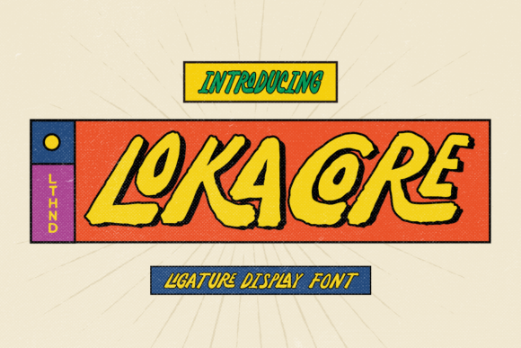
Lokacore is a modern display font with generous letterforms, soft curves, and just enough bounce to feel joyful without sacrificing clarity. Think rounded terminals, open counters, and friendly x-height—all designed for impact at larger sizes. It’s not a script, not a serif, not a monospace—it lives confidently in the display category, where personality matters more than paragraph density. Visually, it straddles the line between contemporary digital charm and hand-drawn sincerity. It doesn’t shout; it winks. And that makes it unusually versatile for digital branding—especially when you need warmth without whimsy overload.
Real-World Web Testing: Where It Shines (and Where It Doesn’t)
I tested Lokacore across three real projects: a boutique online store homepage, a course sales landing page, and a redesigned portfolio hero section. In each case, I used it strictly for primary headlines, section titles, and call-to-action buttons—never for body copy, form fields, or navigation menus. Here’s what held up:
- Hero sections: On light and dark backgrounds alike, Lokacore remained highly legible—even over subtle image overlays. Its contrast and spacing prevented visual “muddiness” at 48–64px on desktop and scaled cleanly down to 36px on mobile.
- Landing page CTAs: As button text (“Start My Journey”, “Grab Your Spot”), it added approachability without undermining urgency. Paired with a clean sans serif like Inter or Manrope for supporting copy, the hierarchy felt intuitive—not forced.
- Section dividers: Used at 28–32px for subheads like “What You’ll Learn” or “Meet Your Guide”, it created gentle visual rhythm without competing with content.
Where it stepped back gracefully? Small interface elements. At under 18px, fine details like inner curves and terminal shapes began to soften—so I avoided it for caption text, footer links, or form labels. It’s not built for dense information architecture. And while it passed basic WCAG contrast checks at headline sizes, I wouldn’t rely on it alone for accessibility-critical UI components without thorough testing.
Pairing It Right: Typography That Works Together
Lokacore thrives in contrast. Its playful energy needs grounding—and that’s where smart font pairing becomes essential. I consistently paired it with a neutral, highly readable sans serif: Inter for web projects (free, variable, excellent hinting), and occasionally Montserrat or Poppins for tighter editorial layouts. The combination creates balance: Lokacore sets tone, the sans carries meaning. For a more editorial or luxury-leaning site, I tried it with a restrained serif like Lora—but only for large quotes or featured testimonials. Never for body text. Lokacore’s voice is too distinct to share paragraph space.
One note on weights: Lokacore includes Regular and Bold, both optimized for screen rendering. No Light or Thin variants—so don’t expect delicate typographic layering. But the Bold holds up beautifully in hero treatments, and the Regular offers enough presence for mid-size headings without overwhelming.
Technical Fit: What You’ll Actually Use (and What to Check)
Before dropping Lokacore into a live site, I verified three things: webfont format support, licensing scope, and multilingual coverage. The package included WOFF2 files (ideal for performance), clear commercial licensing for client sites and SaaS products, and solid Latin character support—including accented characters used across Spanish, French, and German. No Cyrillic or extended Asian language coverage, so I’d avoid it for globally localized interfaces unless paired with fallback fonts.
I also checked ligatures and alternates. Lokacore includes a few discretionary ligatures (like “fl” and “fi”) and stylistic alternates for select letters—great for customizing logo lockups or hero text, but not essential for standard web use. They’re accessible via OpenType features in Figma and CSS font-feature-settings, though I kept them off by default for consistency across browsers.
When to Reach for Lokacore—And When to Pause
You’ll reach for Lokacore when your brand values approachability, creativity, or gentle confidence—think wellness coaches, indie course creators, children’s app marketers, or small-batch product brands. It works especially well for audiences who respond to authenticity over polish: parents, creatives, lifelong learners, and community builders.
Pause before using it for: long-form blog posts, data dashboards, legal disclaimers, multi-step forms, or any context where speed, precision, or neutrality are top priorities. It’s a display font—not a workhorse. But as a strategic accent? It adds dimension, memorability, and quiet distinction. One client told me their bounce rate dropped slightly after swapping their generic headline font for Lokacore—“It just feels like someone *meant* to welcome me,” they said. That’s the quiet power of intentional typography.
If you’re choosing a display font to elevate your next web project—not just decorate it—Lokacore earns its place. It’s not flashy. It’s not loud. But it’s thoughtfully crafted, reliably performant, and quietly effective. Exactly what good digital typography should be.